Saturday, 10 November 2018

Frame Stage

Immediately after the slab was poured, we've moved to the Frame Stage.  Frame for the ground floor is up!  How exciting to see that it's now taking shape!


This is the porch


This is the entry


This is the hallway


This is my future home-office / study


Haven't decided yet what to do with this room; formal lounge or formal dining or music room 2.


This will be the theatre / music room


This is the open plan kitchen and dining room.


This is the open plan living room / dining room

This open plan area (combination of living, meals and kitchen) looks bigger in the display home, not quite sure how it's going to turn out in ours.  Hopefully it will be as nice as the display home.


We've got a Slab!

We hired an independent inspector for every stages.  The first inspection was the Pre-pour inspection.  It was performed by Darbecca on Monday Nov 5.  Some issues were reported and sent to our site supervisor. All issues were minor and rectified before the slab pour.  This is how it looks like now after the slab was poured.


(Couldn't take a proper photo because it was hailing.)

Wednesday, 7 November 2018

Pre-pour Inspection

Our pre-pour inspection has been postponed a few times for various reasons.  The latest one was because of the strong wind and massive dust storm that happened last Friday Nov 2nd.  It was the scariest storm I've experienced in Melbourne.

When the rain stopped, I decided to have a look at our site.  I could not get out of the car because of the very strong wind.  But just by looking outside my car window, i could see how badly affected our site was.  The fence was blown down. Some materials were scattered and broken.😞


Friday, 5 October 2018

Kitchen Colours

Site cut is next week and I'm still doubting my colour selection especially the cupboards and glass splashback colour.  

I initially wanted all the cupboards/cabinets and splashback to be in white but it is hard to find the "right white".  Some white have yellowish tint, some are flat and look like undercoat paint while some just look so bright.  

Then I changed it to grey.  But then again, it's hard to find the right shade of grey.  So we decided to go for Western Myall which is a very dark grey (almost like black) to give my white kitchen a bit of contrast and a bit of mirror effect.

Here are my kitchen colours:


Ready for Site Cut!

And we're ready for site cut!


Monday, 17 September 2018

Additional Window; Removal of Mouldings

We received another Building Variation from Carlisle to adhere with the estate's strict design guideline.  These changes are required to obtain a developer approval.

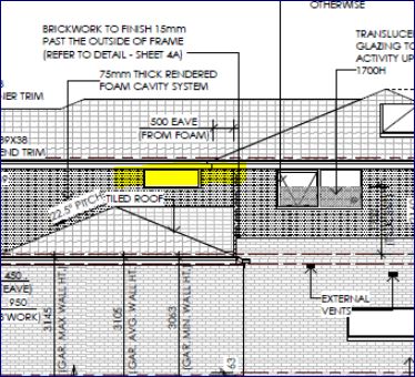
One of the variations is the addition of a highlight window on the stair void wall above the garage to break up the solid wall from the street view.  Hubby and I actually love this variation! It will make our home brighter.


As for the other variation.... I don't really like it but we have no choice.  We have to comply so we can get an approval.  The developer wants us to remove the mouldings on the balcony post as these do not fit in with the Australian contemporary style of the estate. The pictures below highlight the mouldings that they want us to remove.  It is so disappointing.  I really want to have a tradtional looking Hampton facade but with the removal of the mouldings, the character of the house is affected.  It seems to be a small change but to me it makes a lof of difference to the facade.  According to the design panel, these highlighted areas represent a period style feature and would have to be removed.


The balcony will look like the picture below after the mouldings have been removed. It looks so plain :-(


Building Variation 1 & 2

Engineering report was completed and as a result we received a building variation document from Carlisle.  

One of the variations is the provision of a long timber sleeper retaining wall, 200mm from left hand side boundary.  This is an engineering requirement.  Glad that we have a fixed site cost.  Otherwise, it will cost us a few grand.

Another building variation is the provision of a high balustrade on the left hand side of the balcony.  This is due to the overlooking requirement of the estate.  There is a restriction on our title which state that any habitable room within 3500mm from the boundary will need to be screened to avoid overlooking to our neighbour's block of land. 

The high balustrade was initially supposed to be an etched toughened obscure glass like in the picture below. Although it is nice and modern, it doesn't match the Hamptons look of our facade.


Carlisle gave us the option to change it to an aluminium louvre like the one in the picture below.  This balcony looks very much like the balcony of our facade and I think this matches the overall look of the Hampton facade that we are trying to achieve so we went for the louvre.


UPDATE (07/11/2018): The estate overrode this restriction and so it's back to the original design now... no more louvre screen. Yay!

Friday, 31 August 2018

From Grandview to Newington

During our preliminary tender, I asked our tender presenter if the door on the upper level can be centered and aligned to the door on the ground floor.  One of the reasons I chose Grandview facade was because of the symmetry of the windows and doors in both levels.  If that cannot be achieved, then it's not gonna be the same as how I envisioned it to be. Some may not understand but for an OC like me, this is not acceptable (see drawing below). Carlisle said our request is not possible as there is a void in that area behind the door that they are unable to relocate. The void is there for the duct that runs downstairs in that area.


Another option we asked for was if we can remove one of the windows upstairs and convert the door to 3-panels. The void will still be there but at least I won't expect a symmetry and I'll be fine with it.  The two drawings below were done by hubby in photoshop so we can explain what we want to Carlisle better.


With this option, there is still a void area but it looks much better than what they initially suggested.


Carlisle said this option is still not possible.  They suggested to move the walk-in robe to the other end of the master bedroom. It would not be a walk-in robe anymore; instead, it would just be a built-in robe with sliding doors.  It will also be smaller than the original WIR.  And it would be chargeable!  Why would I pay extra for a downgrade? If it wasn't chargeable I would have agreed to it.

After days of arguing with them, we decided to change the facade to Newington.  This is actually one of my favourite Carlisle facades.  I like its Hamptons look but it was more expensive than Grandview... more than double its price! That is why we didn't choose this initially. 


With Newington, I don't have to worry about the symmetry.  There will still be a void on the right side but the 1st floor will have Sycon cladding and it's a 3-panel door so I think it would still look great. Hopefully there'll be no more issues with the facade.


Monday, 27 August 2018

Soil Test and Survey Reports

Our soil test result came back today and ours is Class H2.

From what I've read H2 is Highly reactive clay site. It may experience high ground movement as a result of soil conditions and moisture changes.  Still waiting for Engineering report.


Survey report also came back; It says all our pegs were located... that means we don't need to pay for re-establishment of pegs which costs approx $1200. 

Saturday, 25 August 2018

Choosing our Land

Remembering the day, a year ago, when we had to camp out just so we could reserve a lot.

The engineering plan was sent just several hours before the release. So while camped out, we tried to understand the technicalities of the engineering plan and picked our 1st,  2nd, up to 6th choice.  It was a first come, first served system and we were number 6 so we had to be prepared in case our first choice was taken.  Once inside the office, we were only given 10 mins to choose and complete all paper works.  The wait was not bad at all, they provided free hot drinks and we were able to chat and got to know our potential neighbours.


Our criteria:
- of course, it has to be within our budget
- not too big, because it will be difficult to maintain
not a corner lot, because of the many restrictions
- not located in a T-junction, because of the risk of its location and many other cons
- no big fall,  because this usually means higher site cost and it is also more prone to movements (as most of the people we talk to say)
- not very close to the playground or splash park because it can be a noisy and busy.
- not very major but if we could get a land that is facing the lake or even a lakefront; that would be a bonus.  Unfortunately, in the stage that was released then, there were no lakefront lots.  And even if there was, it would be too close to the splash park.

Frame Stage

Immediately after the slab was poured, we've moved to the Frame Stage.  Frame for the ground floor is up!  How exciting to see that it&#...